Berlin
INFOSProject: Play area and bedroom for a child
Completion date: 02/2019
Location: Ossastraße, BERLIN Neukölln
Architect: Paola Bagna & Ziel:Architektur
Area: 40 m2
CREDITSCarpenter: Kito Colchester
Photographer: Liz Eve
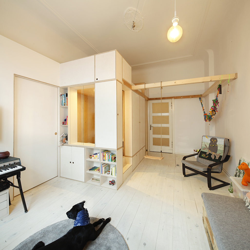
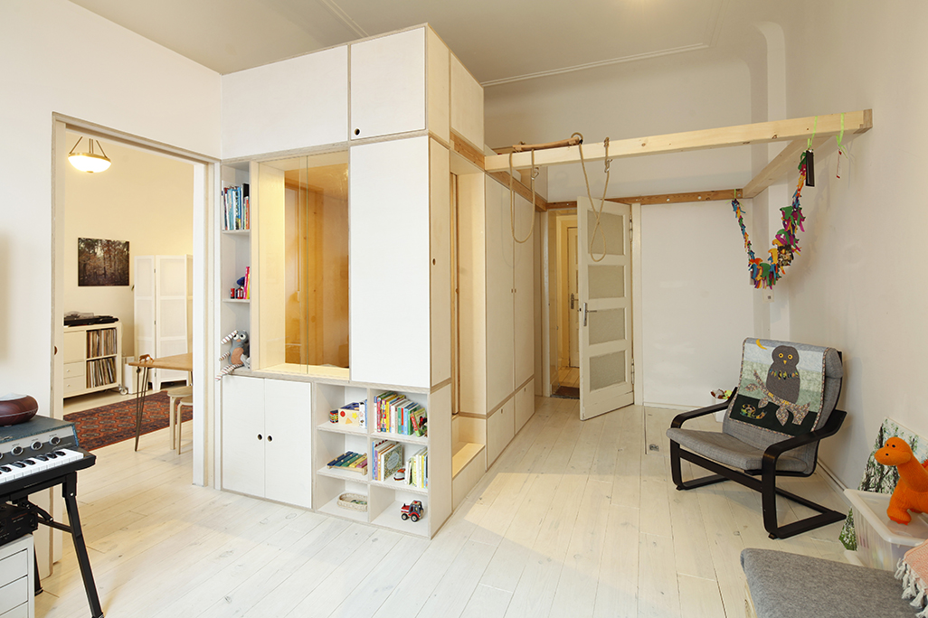
Paola Bagna and Ziel:Architektur integrated a tiny home within a Berlin Altbau apartment, creating more space and light for a young family.
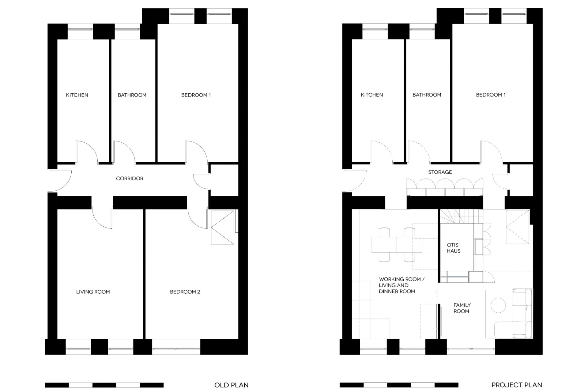
Located in a ground floor Neukölln apartment, this project set about blurring the lines of the original rigid layout. Two street-facing front rooms were connected to achieve longer vistas and greater diffusion of natural light.
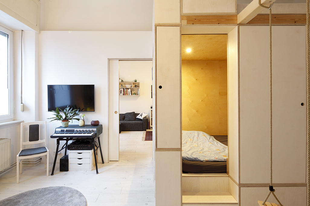
Residents Tim, a technical director for exhibitions and Liz, an architectural photographer, work partially from home. They desired a defined workspace, separated from the family room. The centre point of the family living space became an autonomous house for their son Otis, with extra adult sleeping accommodation above. A tiny home within the home.
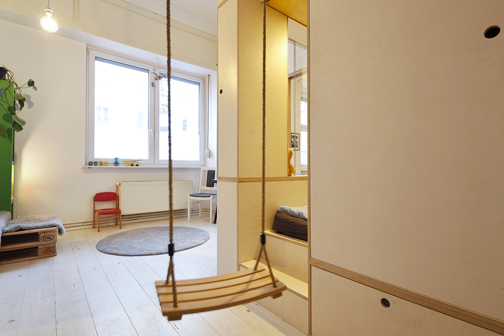
The architects developed a cube concept which emphasized a circular flow around the front part of the house, perfect for children to build a toy train-track or run around with friends. This shake-up of the floor plan feels dynamic and polyvalent, suggesting various future uses. Private, family orientated space now contrasts with the public office space used by the international photographic agency fotohaus.
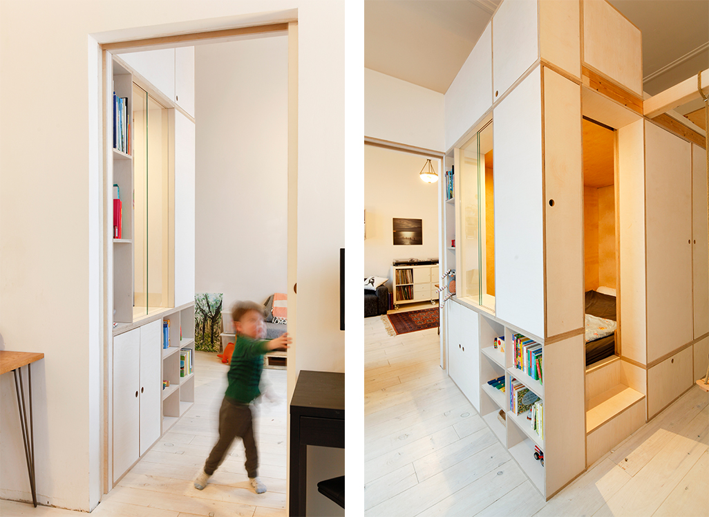
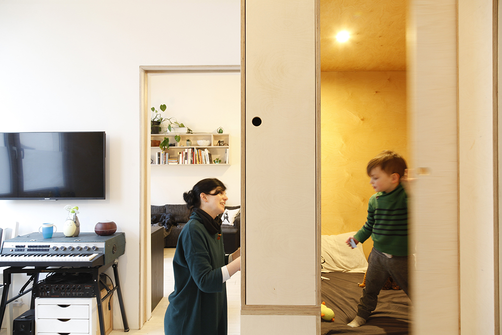
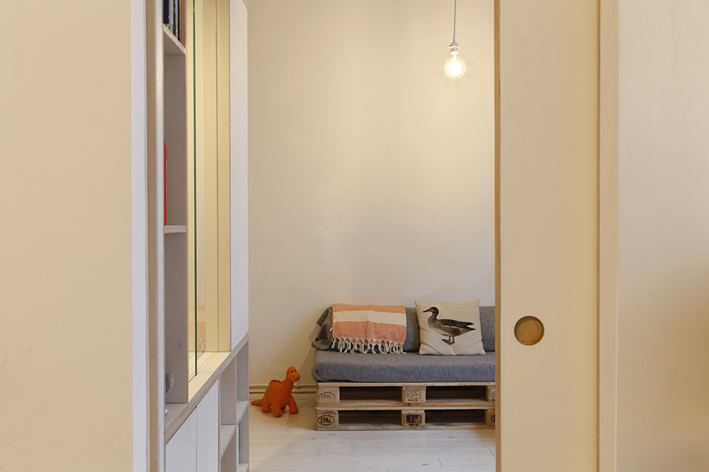
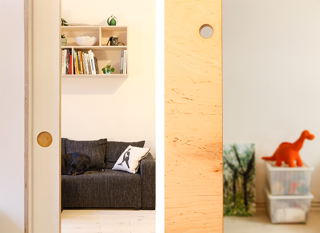
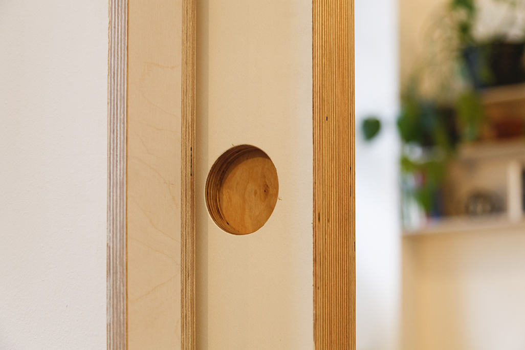
A thick sliding door featuring exposed birch plywood on its edge is used to separate or join the two large rooms, now office style workspace and play zone respectively.
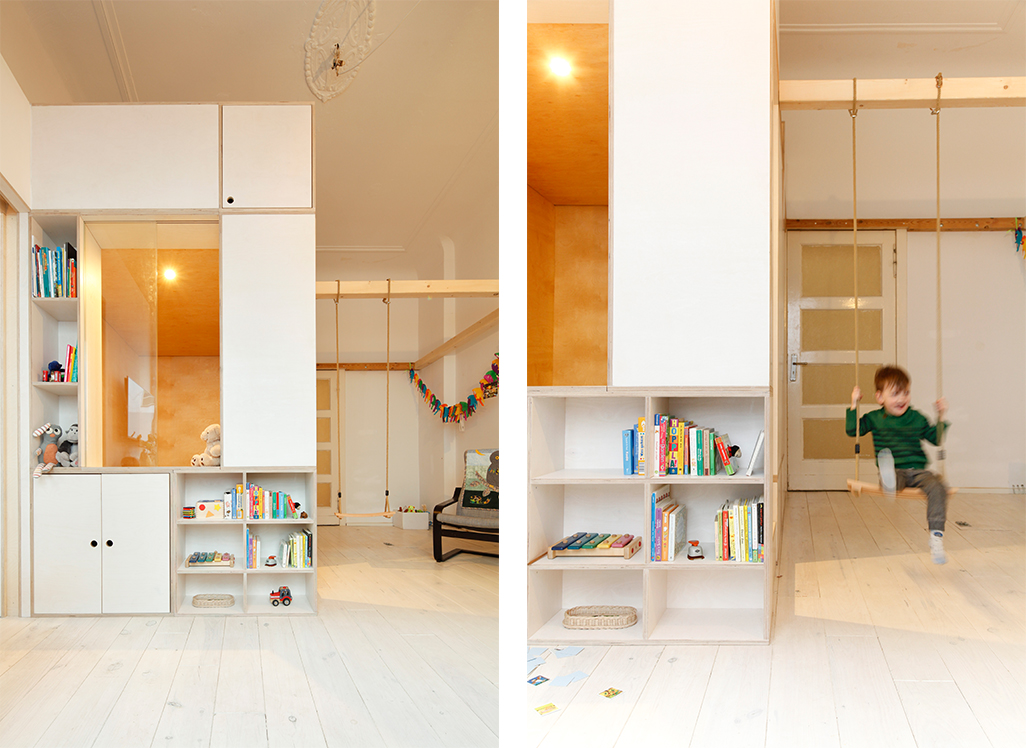
The cube is executed in plywood, finished in semi-opaque wax to keep a raw quality and connect it to the whitewashed wooden floor and white walls.
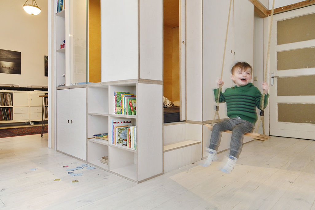
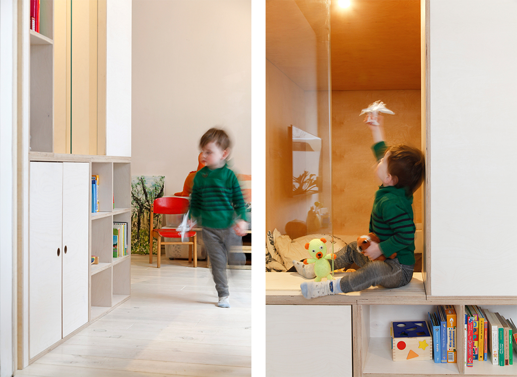
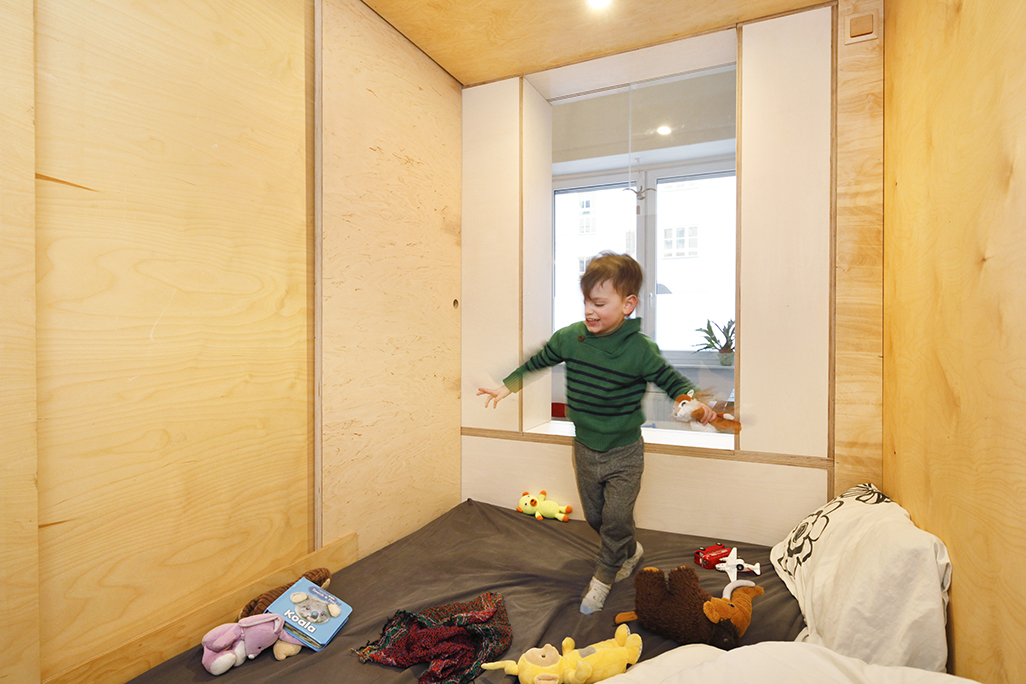
A window between the cube and living area enables ventilation plus interaction between those inside and 'out'. The box interior can be used for sleeping and soft play. Materiality connects the box with other furniture pieces such as the plywood shelves in the office by Dittmar and Friends and planned tall hallway cupboards will unify the scheme and demarcate the larger cube concept.
Otis took ownership of his space from the very beginning, proudly inviting visitors to 'Come in!'. The side entrance opens and closes with a lightweight sliding door. Small fingers easily operate the cut out circular handle.
Modular construction enabled a faster and less disruptive build by carpenter and product designer Kito Colchester as it consisted mostly of clean, dust free assembling works.
The cube is designed to later accommodate stairs to the rear wall. The idea is that the cube can evolve with Otis once he's old enough to decide how he wants to use it. The rooftop could become a second playground or sleeping area, leaving the lower area as a study area or a guest bed.
Hemp netting will complete the cube's area of intervention, creating a transparent attic in the room. A floating chill out zone or reading corner. For the time being, a swing opens up the play possibilities and provides a taste of what's to come.
drawings
